Cartographic representations of the world have always been in flux.
And, from Babylonian clay tablets, through Mercator’s revolutionary projection of the earth, to British naval hydrography and the modernday global positioning system, most have typically followed a trajectory of geographic accuracy.
However, maps have served other purposes too. Some were designed simply to communicate ideologies or shine a light on geopolitics.
The possibilities of pictorial maps were first explored in the medieval period with the allegorical and symbolic mappa mundi, which chose meaning above mathematics. Not intended as geographic aids, instead they were created to express truths, falsehoods and contemporary fears about the world they lived in.
By 1537 Johannes Putsch had expanded on the genre to project a Habsburgian political reading of 16th century Europe with the first anthropomorphic map. Reprinted by the German theologian Heinrich Bunting (1545-1606) as In Itinerarium Sacrae Scripturae (1581), this famous image depicts Europe as a queen with Habsburg Spain shown preeminent as the head and crown and Bohemia at its heart.
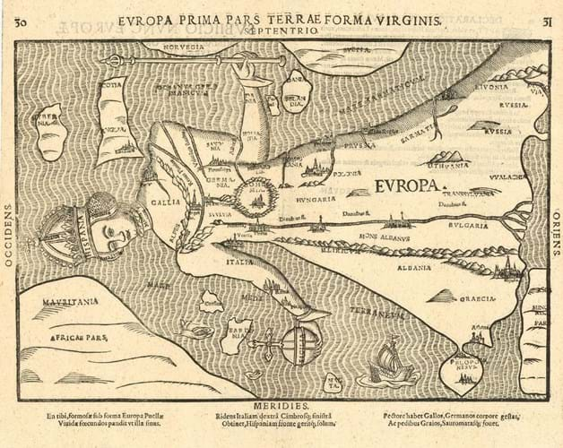
Heinrich Bunting, 'Europa Prima Pars Terrae in Forma Virginis', woodcut c.1581. Priced at £3250 from Altea Gallery.
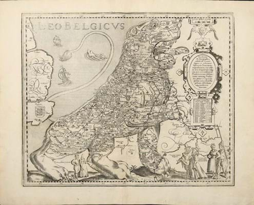
Leo Belgicus
The riposte from the Cologne engraver Michael von Aitzing in 1583 was a zoomorphic map that showed the 17 provinces of the Netherlands in the form of a lion. He cleverly used the contours of the North Sea coastline to create the spine of the lion – a symbol included in the heraldry of the provinces of the Dutch Republic and one that stood as a representation of the resistance to the imperial rule of the Hapsburgs.
The Leo Belgicus maps, published up to the 19th century, pioneered the introduction of national symbols and stereotypes into cartography. And this concept, when taken up by the brightest British minds, quickly led to satire.
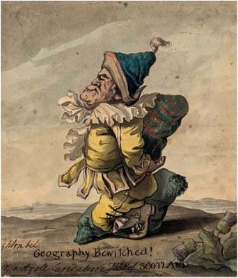
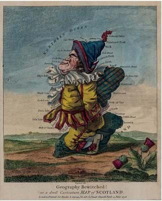
In the 1790s the caricature artist Robert Dighton (1752-1814) produced his famous maps of the British Isles titled Geography Bewitched!
The set portrays England and Wales as a jauntily dressed man, pint of ale in hand and riding a monstrous fish; Scotland as a merry hump-backed jester; and Ireland as a woman in traditional dress playing the Irish harp.
Most copies sell for around £500 but in June 2020 Forum Auctions offered one of the original drawings – that titled Geography Bewitched! or, a droll Caricature Map of Scotland. It sold together with an engraving c.1796 for £4550.
While Dighton’s manipulation was relatively light-hearted – and wellreceived by both his public and future generations of collectors – it hinted at the arrival in the 19th century of the best-known examples of ‘seriouscomical’ or serio-comic mapping used to express nationalist sentiment and as a tool for propaganda.
They proved the perfect vehicle for explaining the often complex system of treaties and rivalries which maintained the balance of power in Europe and Asia.
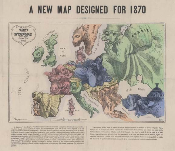
It was in the wake of the Crimean War that Parisian artist Paul Hadol (1835-75) created A New Map Designed for 1870 – the defining template for the European serio-comic map. The English edition satirises the tensions that would shortly erupt into the Franco-Prussian War. It shows Britain as an old woman hiding her face from the rest of Europe, with Ireland, her rebellious lapdog, turning to snarl at her.
However, more dominant than the other satirical representations of European powers is the caricature of Russia, depicted as a monstrous rag collector whose coat is made up of captured pieces of territory. The latest addition, Crimea, has just been sewn on; behind his cloak looms an army of wolves.
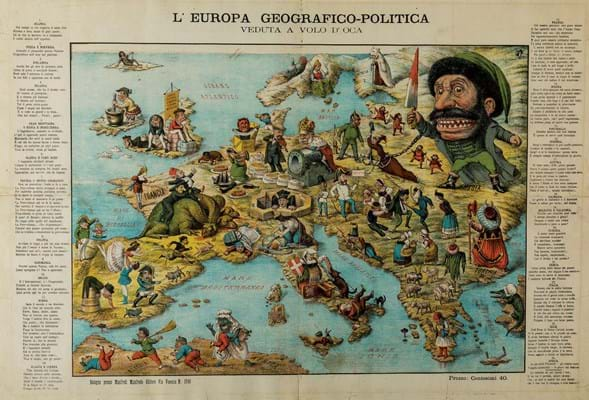
In a slightly later Italian map published in Bologna, the anonymous cartographer takes the much the same approach, depicting national stereotypes running amok across the page. Russia is shown as a rabid moustached man baring his teeth and wielding a bloodied dagger.
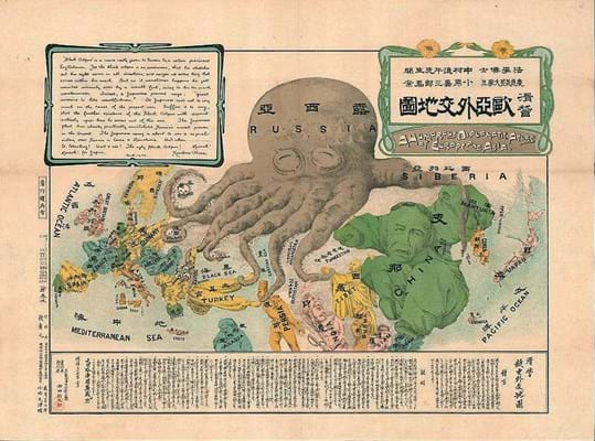
Some of the most familiar and popular serio-comic maps of the period were produced by Fred Rose (1849-1915), who took the attack on Russian expansionism to a new level in the late 1870s with his Octopus Map of Europe.
Created by Rose (a 27-year-old junior clerk at the Inland Revenue) just two months after the outbreak of the Russo-Turkish War of 1877–78, it proved so popular (and the political situation changed so much) that it was produced in at least five variants into the 20th century.
A version was printed in Farsi, another was created for a Japanese audience by Kisahuro Ohara in 1904. All depict Russia as a giant black octopus, with tentacles going in all directions and seizing everything it can.
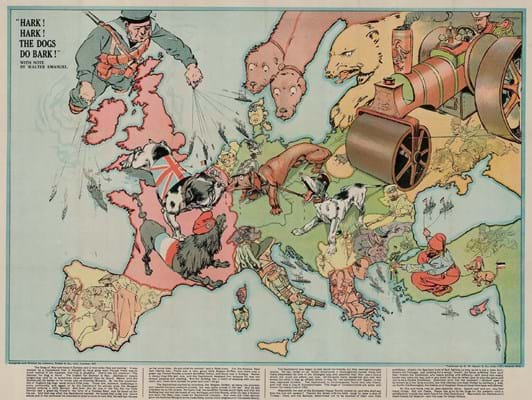
The shift in European power that arrived with world war in 1914 was met by Walter Emanuel with Hark! Hark! The Dogs Do Bark!.
The Great War is depicted as a dogfight with the British bulldog, French poodle and Belgian griffon on one side and the German dachshund and ‘Austrian mongrel’ on the other. The Russian bear is accompanied by Tsar Nicholas behind the wheel of a steamroller that is crushing the Austrian’s tail. London map dealer Altea Gallery has one in stock priced at £2400.
The serio-comic map proved fertile ground for political commentators deep into the 20th century – an effective way to communicate the rise of Bolshevism, Nazi aggression or Cold-War politics. And if many of the motifs used in these centuries-old images are familiar, that is because they continue to be recycled by today’s political cartoonists.
From the Blair-Bush alliance to the Trump-Putin era, the serio-comic map remains relevant today.
For a more detailed discussion of the topic, see Philip Curtis and Jakob Søndergård Pedersen’s War Map. Pictorial Conflict Maps 1900-1950 (2016) and Ashley Baynton-Williams’ The Curious Map Book (2015).
By Richard Carroll
Richard Carroll is 16th to 19th century works on paper specialist at Forum Auctions.

